
PANTONE COLOR OF THE YEAR 2022

ANNOUNCING THE PANTONE COLOR OF THE YEAR 2022
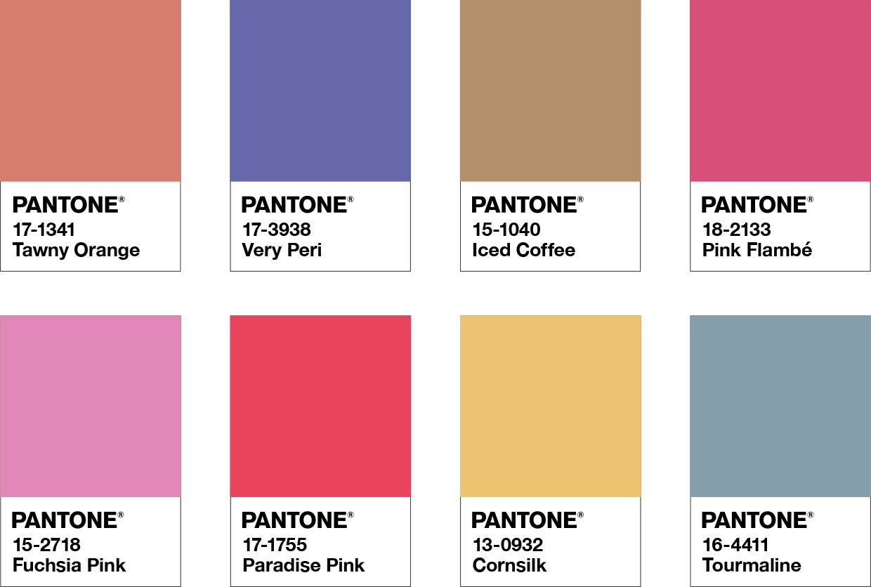
PANTONE 17-3938 Very Peri
A New Pantone Color Whose Courageous Presence Encourages Personal Inventiveness And Creativity.
Displaying a carefree confidence and a daring curiosity that animates our creative spirit, inquisitive and intriguing PANTONE 17-3938 Very Peri helps us to embrace this altered landscape of possibilities, opening us up to a new vision as we rewrite our lives. Rekindling gratitude for some of the qualities that blue represents complemented by a new perspective that resonates today, PANTONE 17-3938 Very Peri places the future ahead in a new light.
We are living in transformative times. PANTONE 17-3938 Very Peri is a symbol of the global zeitgeist of the moment and the transition we are going through. As we emerge from an intense period of isolation, our notions and standards are changing, and our physical and digital lives have merged in new ways. Digital design helps us to stretch the limits of reality, opening the door to a dynamic virtual world where we can explore and create new color possibilities. With trends in gaming, the expanding popularity of the metaverse and rising artistic community in the digital space PANTONE 17-3938 Very Peri illustrates the fusion of modern life and how color trends in the digital world are being manifested in the physical world and vice versa.
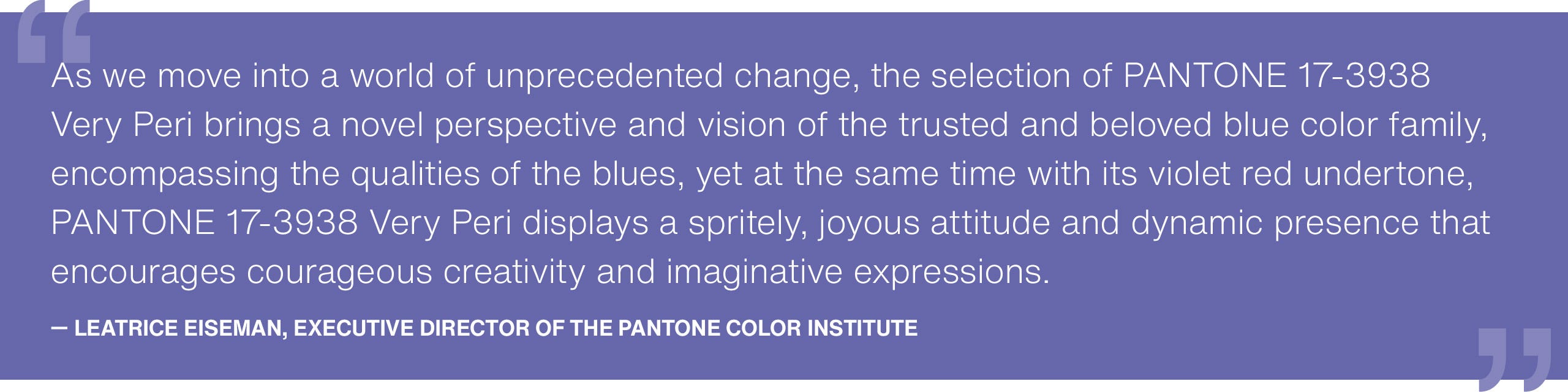
“The Pantone Color of the Year reflects what is taking place in our global culture, expressing what people are looking for that color can hope to answer.” added Laurie Pressman, Vice President of the Pantone Color Institute. “Creating a new color for the first time in the history of our Pantone Color of the Year educational color program reflects the global innovation and transformation taking place. As society continues to recognize color as a critical form of communication, and a way to express and affect ideas and emotions and engage and connect, the complexity of this new red violet infused blue hue highlights the expansive possibilities that lay before us”.
Encompassing the qualities of the blues, yet at the same time possessing a violet-red undertone, PANTONE 17-3938 Very Peri displays a spritely, joyous attitude and dynamic presence that encourages courageous creativity and imaginative expression.
ABOUT PANTONE COLOR OF THE YEAR
The Pantone Color of the Year selection process requires thoughtful consideration and trend analysis. To arrive at the selection each year, Pantone’s color experts at the Pantone Color Institute™ comb the world looking for new color influences. These can include the entertainment industry and films in production, traveling art collections and new artists, fashion, all areas of design, popular travel destinations, as well as new lifestyles, playstyles, and socio-economic conditions. Influences may also stem from new technologies, materials, textures, and effects that impact color, relevant social media platforms and even upcoming sporting events that capture worldwide attention. For 23 years, Pantone’s Color of the Year has influenced product development and purchasing decisions in multiple industries, including fashion, home furnishings, and industrial design, as well as product packaging and graphic design.
Tools For Designers
More than 10 million designers and producers around the world rely on Pantone Products and Services to help define, communicate and control color from inspiration to realization—leveraging advanced X-Rite technology to achieve color consistency across various materials and finishes for graphics, fashion, and product design. Pantone Standards feature digital and physical color specification and workflow tools. Read on to learn more about applying the Color of the Year 2022 across various industries, determine color values across our color systems, explore palettes and color harmonies, and more.
USAGE
2022 marks the first time a color has been custom created for the Pantone Color of the Year program. PANTONE 17-3938 Very Peri blends the faithfulness and constancy of blue with the energy and excitement of red to introduce an empowering mix of newness to apparel, beauty, home furnishings, product design, and packaging.
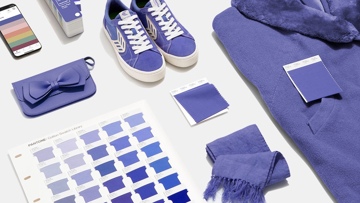
VERY PERI IN APPAREL AND FASHION ACCESSORIES
PANTONE 17-3938 Very Peri, a warm and friendly blue hue with a carefree confidence and joyful attitude, emboldens uninhibited expression and experimentation. This enthusiastic blue hue displays a dynamic presence and a whimsicality that lends itself to unpredictable color harmonies and spontaneous color statements. Futuristic in feeling, PANTONE 17-3938 Very Peri takes on distinct appearances through application to different materials, finishes, and textures, from shimmery metallics, lustrous sheens, and high-tech materials, to hand-crafted looks and natural fibers.
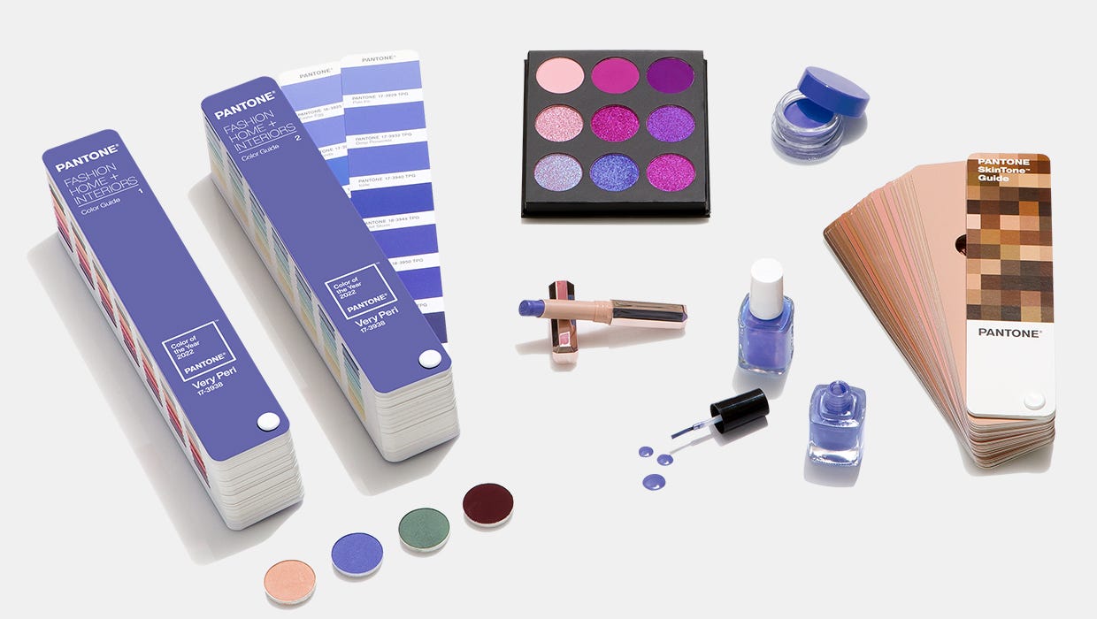
VERY PERI IN BEAUTY
Suggestive of personal inventiveness and daring imagination, PANTONE 17-3938 Very Peri makes a novel statement for eyes, nails, and especially hair when used in a variety of finishes and applications, from glittery and glam, to dusty matte.
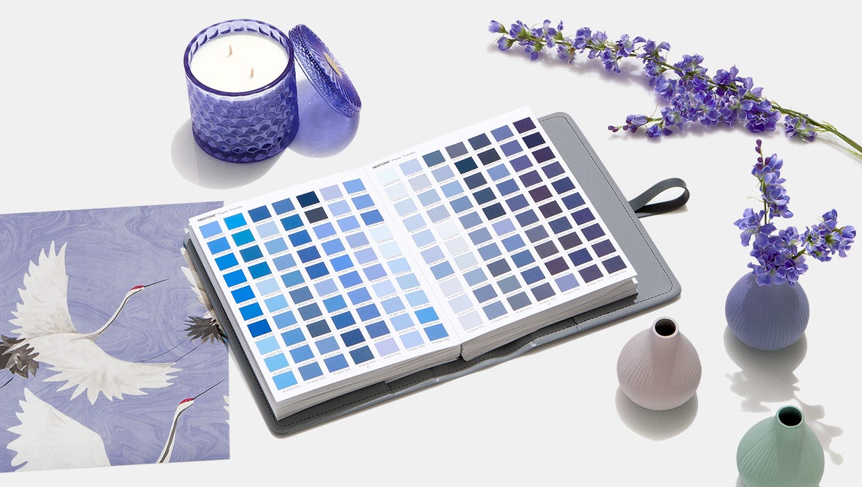
VERY PERI IN HOME DÉCOR
Evocative of a new modernity, PANTONE 17-3938 Very Peri injects a sense of playful freshness into home interiors, enlivening a space through unusual color combinations. A versatile shade that animates our creative spirit, PANTONE 17-3938 Very Peri is suited to an array of different materials, textures, and finishes, providing a pop of color whether introduced through a painted wall, statement furniture or home décor, or acting as an intriguing and eye-catching accent in a pattern.
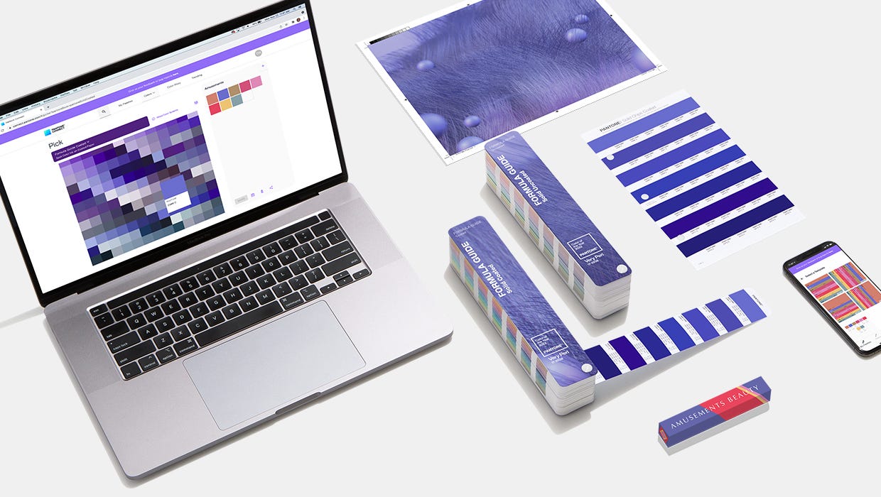
VERY PERI IN PACKAGING AND MULTI-MEDIA DESIGN
Fusing together the constancy and continuity of blue with the energy and excitement of red, PANTONE 17-3938 Very Peri conveys a message of credibility as well as creativity. Whether appearing in a fantasy digital realm or in physical materials, PANTONE 17-3938 Very Peri exudes a good-natured warmth that quickly engages the eye, making it an ideal shade for many applications of graphic and multi-media design, as well as packaging.
CREATE WITH PANTONE 17-3938 VERY PERI
Pantone Connect, a digital color platform for designers available on web, via mobile apps, and as an extension for Adobe® Creative Cloud®, includes four different pre-loaded color palettes featuring Very Peri. These Color of the Year-themed palettes, along with every other Pantone Colour, are available to share, save, and use in your design files within Adobe Photoshop®, Illustrator®, and InDesign®. With a free Pantone Connect account, designers can access many other time-saving features to find inspirational colors, save color palettes, and design with achievable Pantone Color.
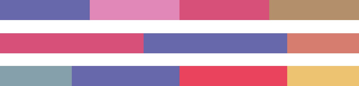
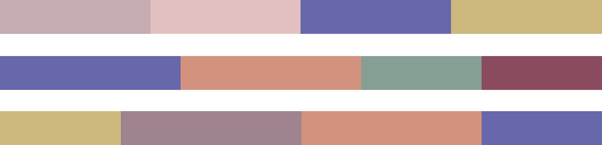
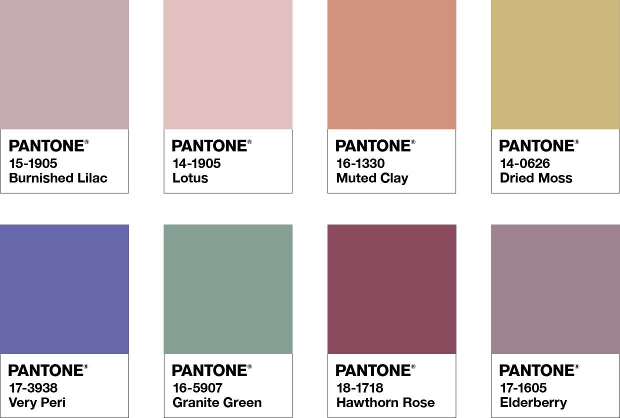
BALANCING ACT
Balancing Act is a complementary palette of color whose natural balance of warm and cool tones support and enhance one other. The brilliance of PANTONE 17-3938 Very Peri is intensified within this artfully calibrated palette, injecting a feeling of liveliness and visual vibration.
Color Harmonies
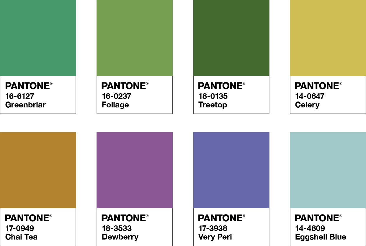
WELLSPRING
A holistic and harmonious blend of nature infused shades, Wellspring highlights the compatibility of the greens with good-natured PANTONE 17-3938 Very Peri, and the health-giving properties of these deliciously subtle and nourishing hues.
Color Harmonies

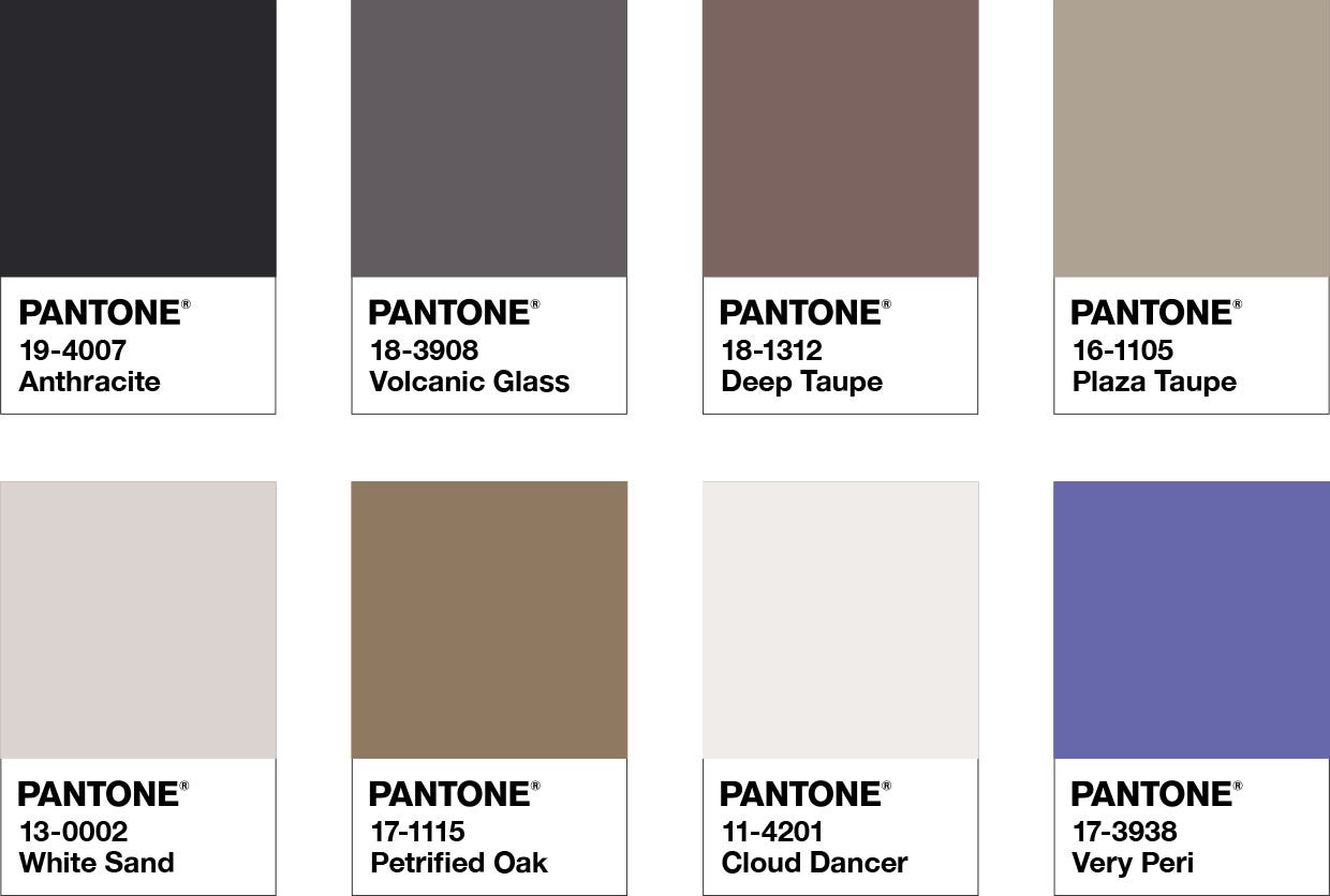
THE STAR OF THE SHOW
The dynamic presence of PANTONE 17-3938 Very Peri comes through in The Star of the Show, as we surround this happiest and warmest of all the blue hues with a palette of classics and neutrals whose essence of elegance and understated stylishness convey a message of timeless sophistication.
Color Harmonies

AMUSEMENTS
Amusements, a joyous and whimsical color story of irrepressible fun and spontaneity is amplified by the carefree confidence and joyful attitude of PANTONE 17-3938 Very Peri, a twinkling blue hue whose playfulness emboldens uninhibited expression and experimentation.
Color Harmonies